|
Thom Browne: Back to Black Only when I looked into the intense, decorative darkness of Thom Browne’s collection, did I realise how relatively little black we have seen at New York Fall/Winter 2015. 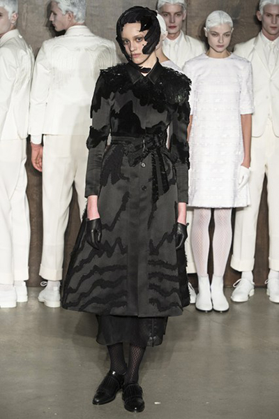 Picture credit: Indigital With colour – especially the favoured 1970s orange – brightening up the season, Thom Browne’s success was remarkable. His women were, of course, dying for the black widow look: faces veiled, a hat whooshed up like a sailboat, the clothes tailored to perfection. In what was initially a medical scenario, the set built of circular wooden pens featured two white-clad hospital figures apparently ministering to a sick patient, while a parade of women paid homage. 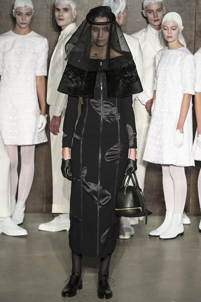 Picture credit: Indigital This ‘hospital’ scene seemed a familiar focus for Browne, though he soon switched to the hospital visitors, whose black ‘mourning’ clothes were densely decorated and often elaborate. “I wanted it to be romantic – and with the one colour, it needed so much texture to give it light,” said the designer, whose varieties of embellishment within a firm framework were powerful. Two examples were a coat’s shearling collar and cuffs, or chiffon and a tie at the neck. The intense attention to detail on graceful clothes with a Victorian feel showed Browne at his darkly imaginative best. And it also raised the question: why do so many collections seem literally as well as metaphorically lightweight? (责任编辑:admin) |